Friday, March 30, 2012
Monday, March 26, 2012
Friday, March 16, 2012
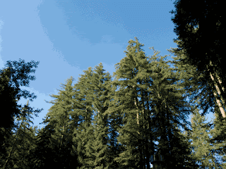
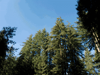
File Format Exercise PART 2 (Forest)
*File go downward, from lowest (file size) at the top (here), to highest (file size) at the bottom.*
*1= lowest, 12= highest*
1. JPEG (low)
2. JPEG (medium)
3. GIF No Dither (32)
4. Restrictive
5. GIF Dithered (32)
6. JPEG (high)
7. GIF No Dither (64)
8. GIF Dithered (64)
9. PNG Dithered (128)
10. GIF No Dither (128)
11. GIF Dithered (128)
12. PNG (24)
File Format Exercise PART 1
The image with the best and largest file size for the multicolored ball was the photo with a PNG-24. For the picture of a forest, the largest and best file size was the photo with a PNG-24 as well. The ball photo with the best quality was defiantly the photo with PNG-24. The forest photo has two types that had the best quality. However, the photo that was a high quality JPEG seemed on par if not better than the PNG-24 photo. The best balance between file and size for the ball photo is the GIF 64-Dithered, which at 74.5kb won out in terms of size for the quality of the photo (the photo being relatively smooth, though not without problems). The best balance between file size and quality for the forest photo is also GIF 64 dithered as well , with the file size being a desirably low number (189kb) and the decent quality.
*The Below numbers will be numbered (1-12), 1 being the smallest and 12 being the biggest*
5. GIF Dithered (32)
6. GIF Not Dithered (32)
8. GIF Dithered (64)
7. GIF Not Dithered (64)
10. GIF Dithered (128)
11. GIF Not Dithered (128)
3. Restirctive
4. JPEG (high)
1. JPEG (low)
2. JPEG (medium)
9. PNG (128) Dithered
12. PNG (24)
Thursday, March 15, 2012
Color Theory Part A, B, and C
Part A
Part B Part C -The three primary colors of pigment generated colors are red, yellow, and blue. The three primary colors of light generated colors are red, green, and blue.
-Secondary colors are created through mixing primary colors together. Such is the case with the color purple, which is made from mixing together red and blue.
-Tertiary colors are created through mixing a primary color with a secondary color. Such is the case with the color red-violet, which is obviously made up of both red (a primary color) and violet (a secondary color).
-The difference between subtractive and additive color models is that additive combines colors to get a color closer to white, while subtractive reflects colors. Also, the additive color model shows up through monitors and colored television, as well as having red, blue, and green as its primary colors. The subtractive color model is used to print things (by adding colors together) and has the primary colors cyan, magenta, and yellow.
-Color has an often huge effect on ones state of mind and mood. Are perception of reality is filtered through color, so it only makes sense that humans would apply their own feelings to what’s going on around them. The color blue, for instance, is the color most likely to make a person sad or depressed. On the flip side, blue can also have a calming affect if the color is light enough. The point is that while colors may not generate moods, they certainly influence moods. The same logic that applies to the color blue also applies to the color red. There is a long standing psychological precedent that connects red with blood, and thus with violence. This is why red is the color most likely to enrage someone, because of the connections are brain automatically makes.
-Colors affect each other by working well together or not working well at all. Complimentary colors (like red and green) when paired effects the viewer by perhaps inciting nostalgia, or by bringing harmony to the person. This is because the two colors work well together, and colors that work well together are more likely to be used again and again (thus how colors gain nostalgic value). Similarly, colors can also clash terribly and bring about discord to a picture. I these cases, and in many others, it’s all about using colors and how they affect each other to your advantage (whether or not you want to make a picture with color harmony, or a disjointed masterpiece).
-An example of a greyscale image:
-An example of a monotone image:
-An example of complimentary colors:
Wednesday, March 7, 2012
Thursday, March 1, 2012
Subscribe to:
Posts (Atom)


